
Work · 03 / 05
The Living Luxe Website
A print magazine with almost no life online, rebuilt as a custom editorial website that readers now find, use and return to.
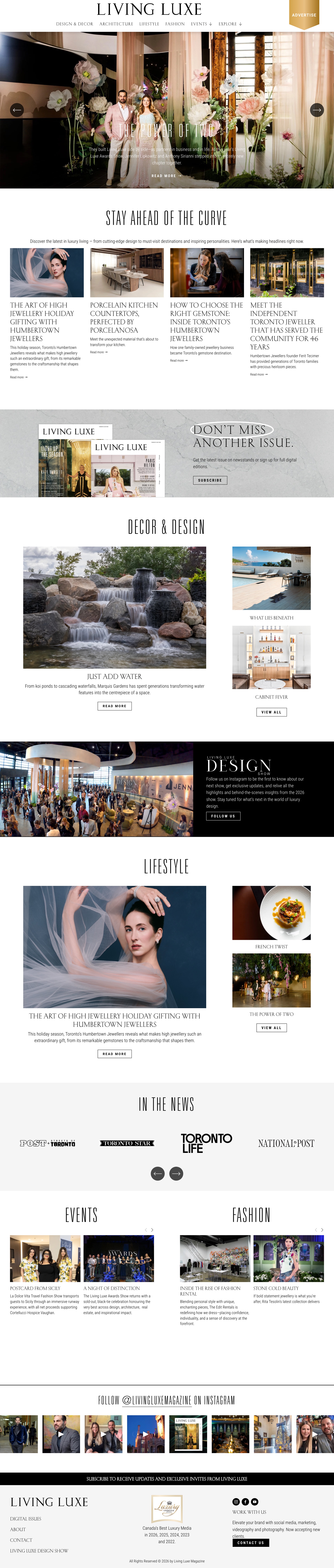

The new homepage
A magazine cover for the web: one lead story at full bleed, then each section in turn, so readers see the breadth of the magazine in a single scroll.
- Role
- Web designer, in-house (sole designer)
- Team
- Editor in chief, marketing and the editorial team
- Platform
- Old: pre-made WordPress theme · New: custom Squarespace build
- Scope
- Audit · Information architecture · UX/UI design · Templates · Build · SEO foundations
- Launch
- May 2026
Problem
A magazine hidden online
The site ran on a dated WordPress theme, rarely updated and invisible in search. In April 2026 it still led with Summer 2025 stories and drew about 9 visits a month.
Solution
An editorial site the team can run
I restructured the content into clear sections, designed reusable homepage, section and story templates, and built it in Squarespace with SEO set up on every page.
Result
Around 500× the traffic
Alongside paid and social campaigns, monthly visits grew about 500-fold within three months of launch, to 6,400+ a month today, and the site helped bring in $55K+ in new partnership revenue within six months.
The starting point
Living Luxe is a Toronto magazine covering luxury design, architecture, fashion and lifestyle, with a print readership of 100,000+ per issue. Online, it was a different story. Before redesigning anything, I audited the old site to understand why it wasn't working.
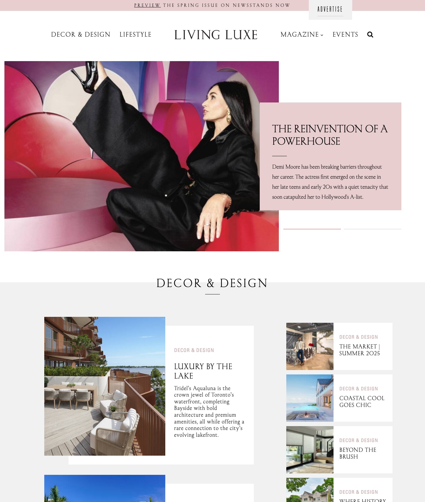 12
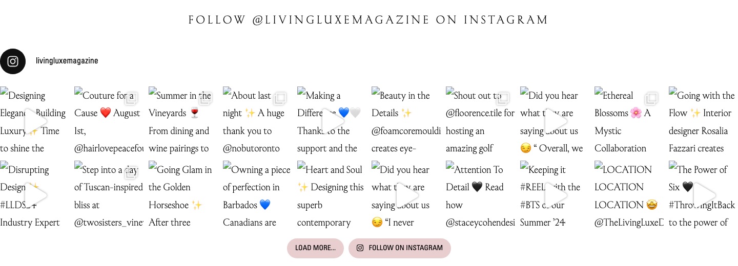 3
Only two ways in
The menu offered just Decor & Design and Lifestyle. Architecture, fashion, events and past issues, the heart of the print magazine, had no clear home.
Out of date at a glance
In April 2026 the homepage still featured "The Market | Summer 2025". The theme made updating hard, so the site looked abandoned.
Broken details
The Instagram feed had stopped loading images, showing raw captions instead: a small sign of a site nobody could maintain.
Invisible in search
With no SEO setup and stale content, the site drew about 9 visits a month, a tiny fraction of the magazine's real audience.
Goals
The audit turned into four goals that guided every decision.
Readers
Find stories easily
Organize years of content into sections that match how people read the magazine.
Editors
Publish without friction
Give the team templates they can update every week, without a developer.
Business
Grow traffic and partners
Be found in search, and give advertisers and event partners a credible home.
Structure
I rebuilt the information architecture around the magazine's own sections, then grouped everything else (the digital issues, events, the design show and the business pages) into a clear second level. Every story now lives in one section and can surface anywhere else.
The pages
Three reusable templates do almost all the work: a homepage, a section page and a story page, plus a home for every digital issue. Each was designed for desktop and mobile together, since about 40% of readers arrive on a phone.
Section pages
Each section opens with its own title and a grid of stories, newest first, so a reader who loves architecture can browse just that, without hunting.
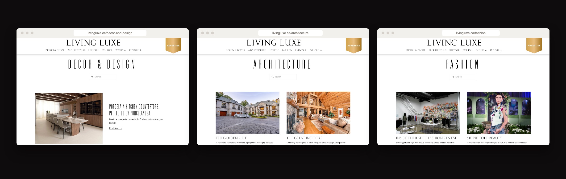
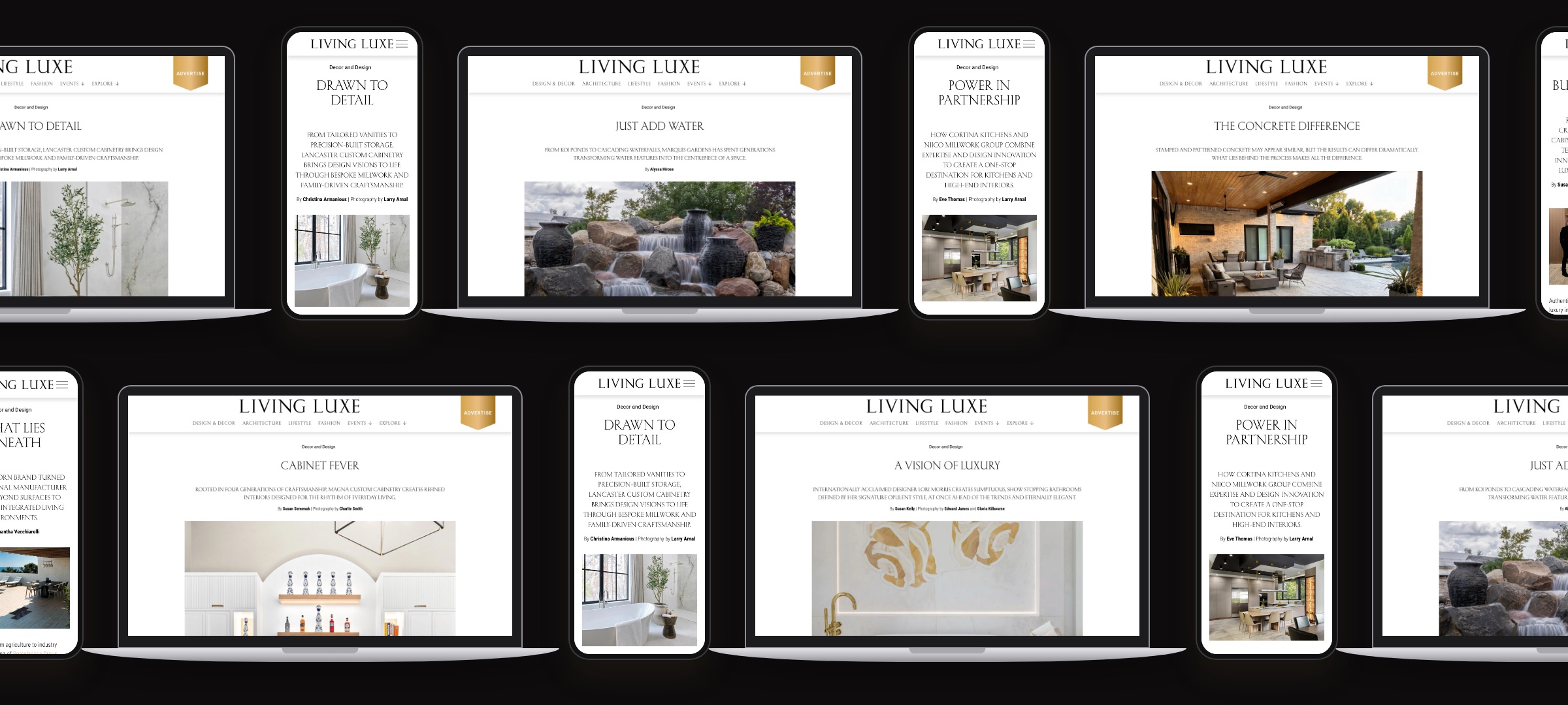
The story template
An editorial layout built to feel like turning a page: a large lead image, a refined type system, generous margins and related stories at the end to keep people reading. Designed for desktop and phone together.
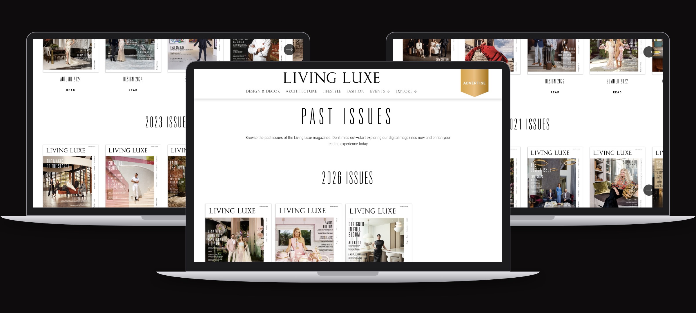
Digital issues
Every print issue, browsable online: a reason for print readers to visit, and an archive advertisers can see.
Under the hood
- Custom Squarespace build, from visual design and navigation to every template.
- SEO foundations on every page: page titles, descriptions, clean addresses and image descriptions.
- A content structure the editorial team updates themselves, every week.
- Email sign-up and advertising enquiries built into the journey.
Result
Alongside paid and social campaigns, monthly visits grew from about 9 to more than 5,000 within three months of launch, and the site now draws 6,400+ visits a month. About 18% of visits now come from Google, so readers find the magazine through search, and they stay: the average visit spends about two minutes on a page. The new site also became something to sell, helping bring in more than $55K in new partnership revenue within six months of launch.
The magazine finally has a home online that matches the quality of the print edition, and a team that can keep it current.