
Work · 04 / 05
Aline Wellness
A warm, uplifting identity and e-commerce website for a functional health space, so it feels nothing like a sterile clinic.
- Role
- Brand, UX/UI & web designer
- Client
- Ali Greco, founder of Aline Wellness, Sault Ste. Marie, Ontario
- Art direction
- Stella Habib & Juliana Holly (The Soulful Entrepreneur)
- Scope
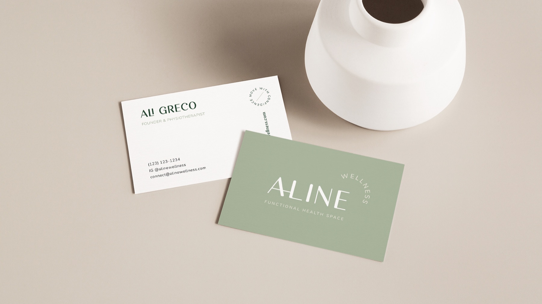
- Brand identity · Aline Active apparel sub-brand · Signage & stationery · Squarespace e-commerce website · Booking, shop and email integrations
Problem
Care that shouldn't feel clinical
Ali, a physiotherapist and pilates instructor, wanted a space that felt joyful and welcoming, not sterile, and already dreamed of an apparel line.
Solution
One family, two brands, one front door
A typography-led identity built on movement, comfort and confidence, Aline Active as its sister brand, and a website where every visitor can learn, book and shop in a few clicks.
Result
A clinic that works online
Aline launched with a full identity and an e-commerce site that takes class and appointment bookings and sells Aline Active and wellness products online.
The brief
Aline Wellness is a functional health space founded by Ali Greco, with a special interest in orthopedic and pelvic health physiotherapy and mat and reformer pilates. Her mission is compassionate, patient-centred care that helps people of all ages move comfortably and confidently.
She wanted a brand as warm as the space itself: uplifting, approachable and inclusive of every gender and background. From our first call she also shared a longer dream, an apparel and accessories line called Aline Active.
Brand identity
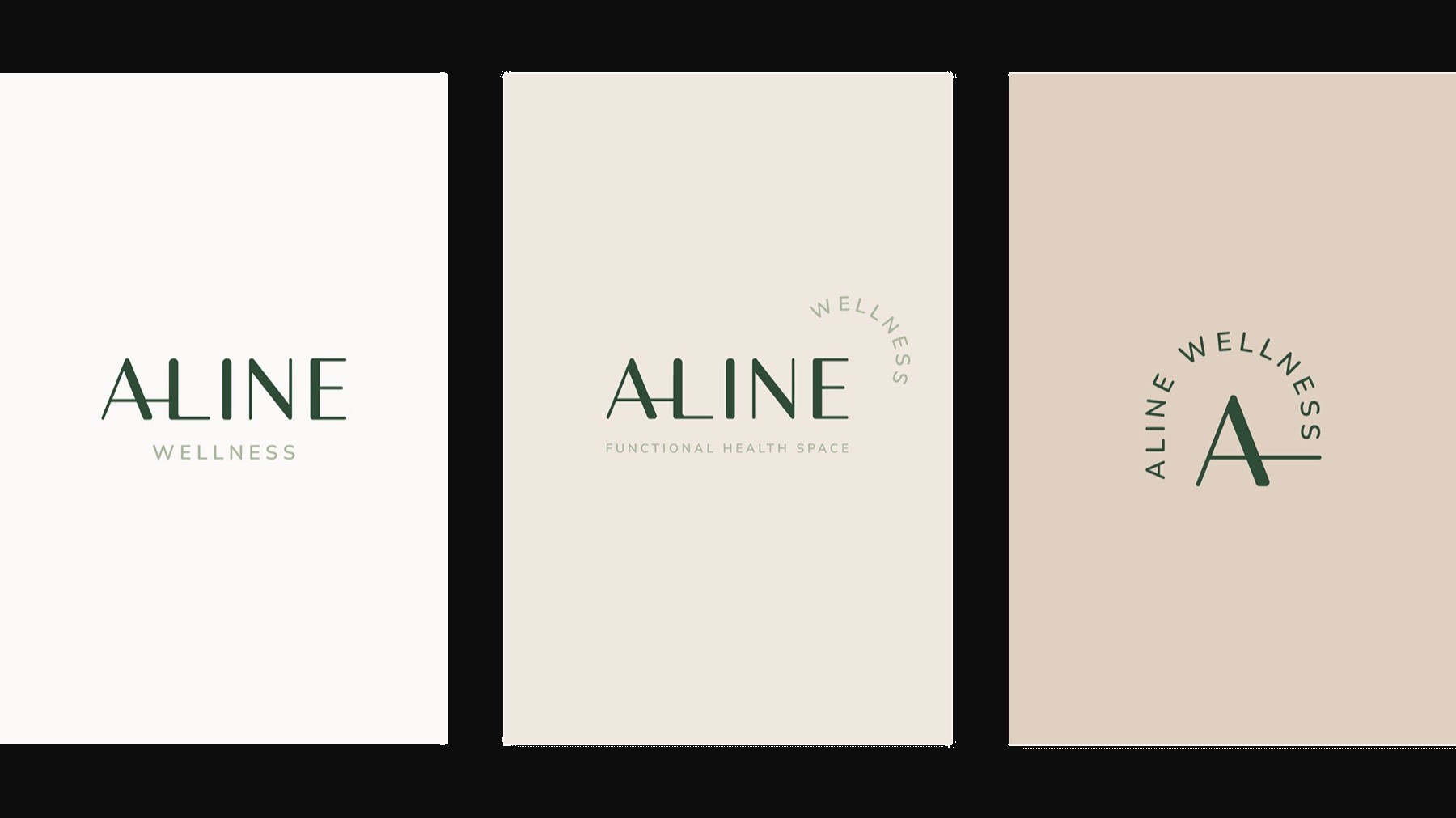
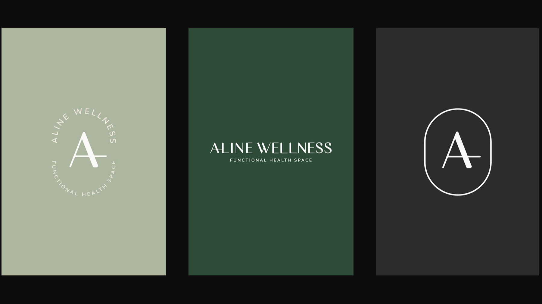
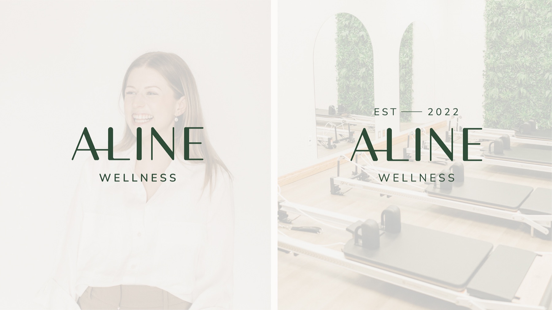
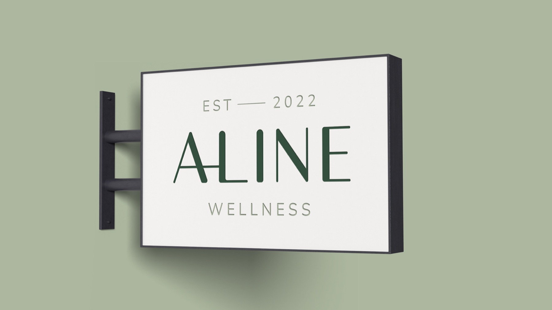
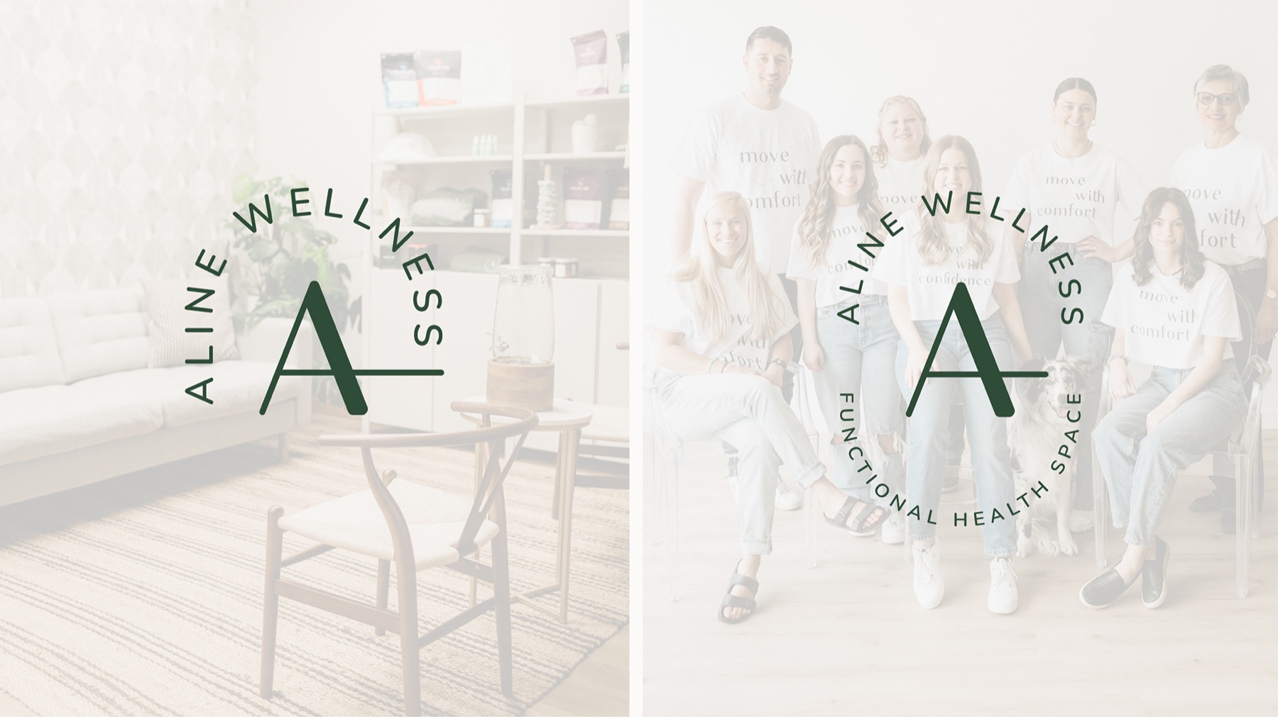
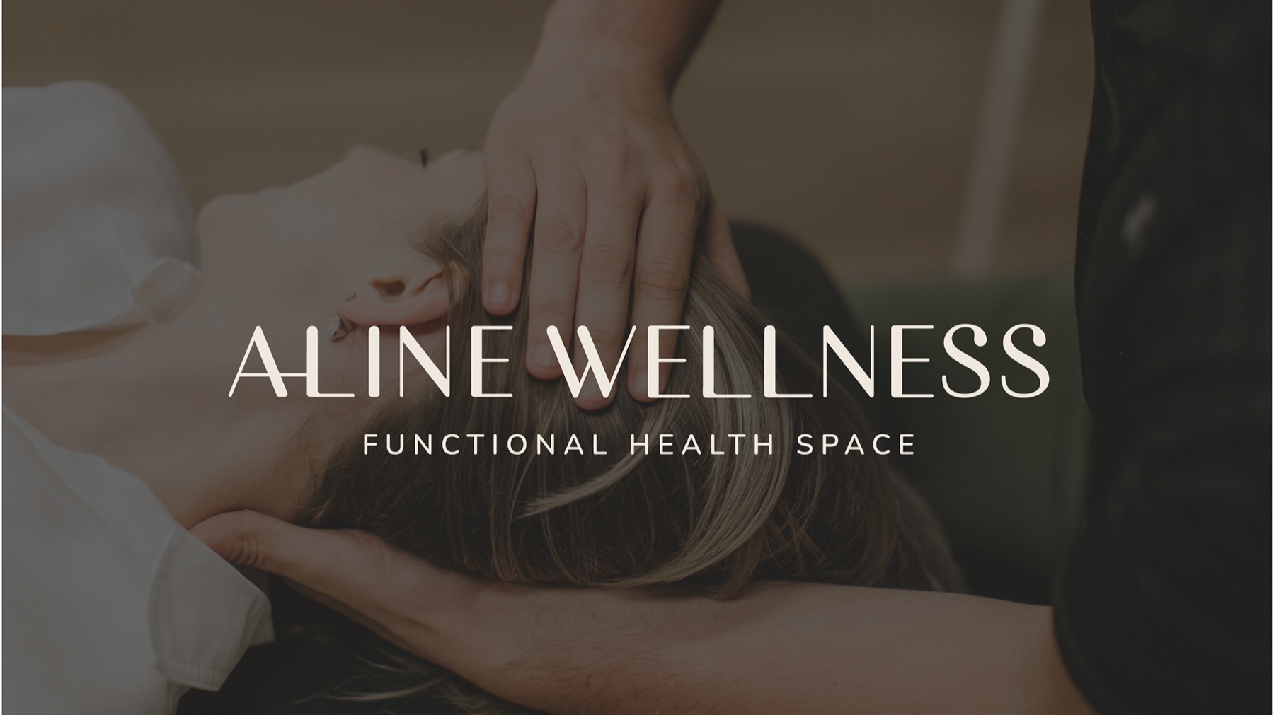
The logo is typography-led and carries its meaning in small, deliberate details, so it stays minimal, light and calm.

The cross of the ‘a’ has been customized to connect to the ‘l’ to both literally emphasize the concept of a ‘line’ in alignment and to evoke feelings of connection, community and support, as an arm would around someone’s shoulder.

‘Aline’ is written in uppercase letters to feel confident, grounded and present. When the type is written in all uppercase, the height is consistent, which also promotes feelings of balance.

‘Wellness’ is written in uppercase letters to parallel ‘aline’ but in a smaller font size in a lighter weight to give more attention to the primary focus of the brand name.
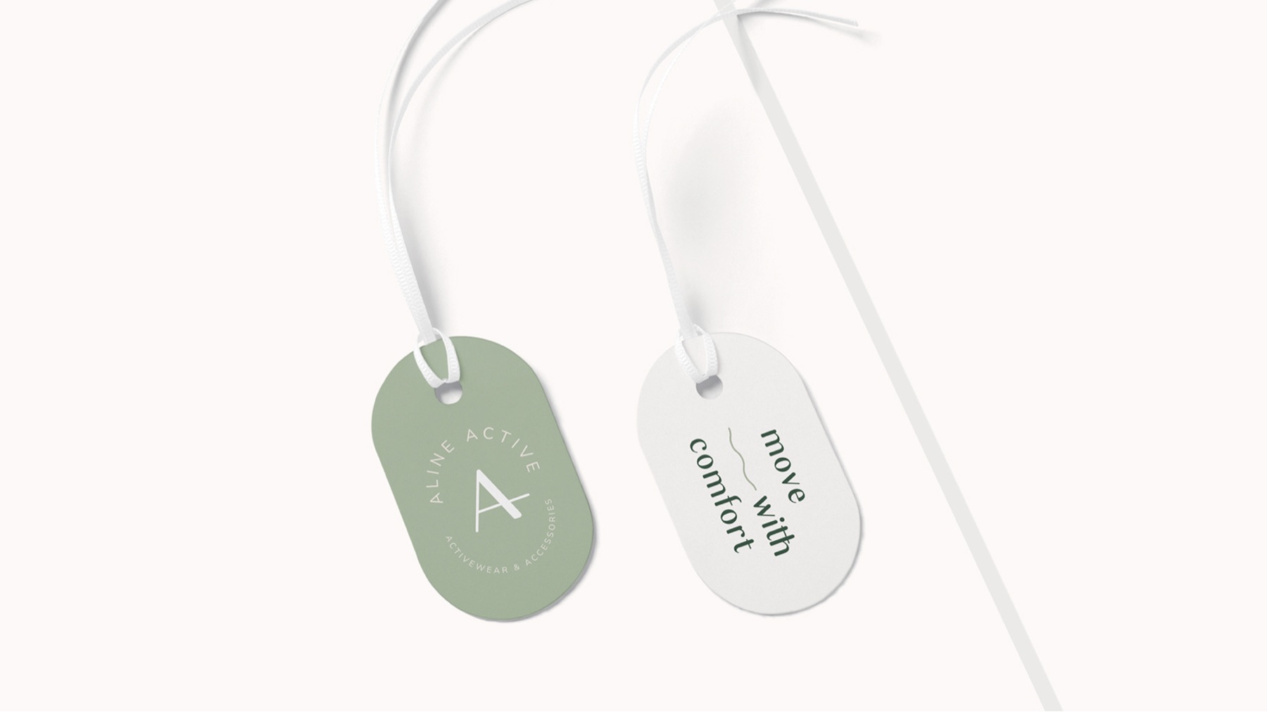

Aline Active
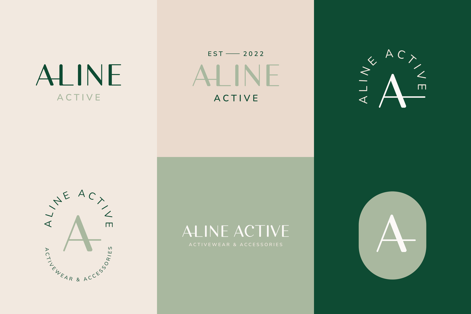
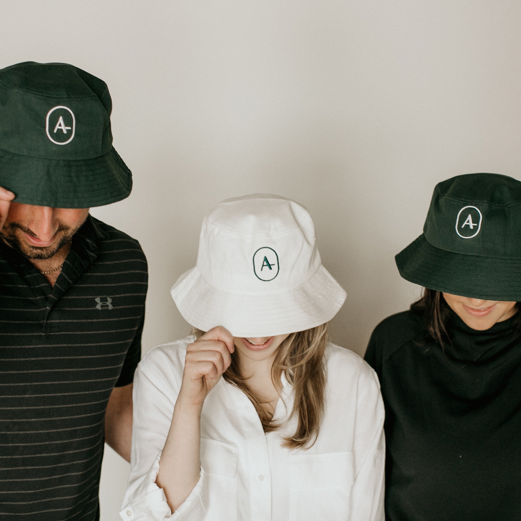
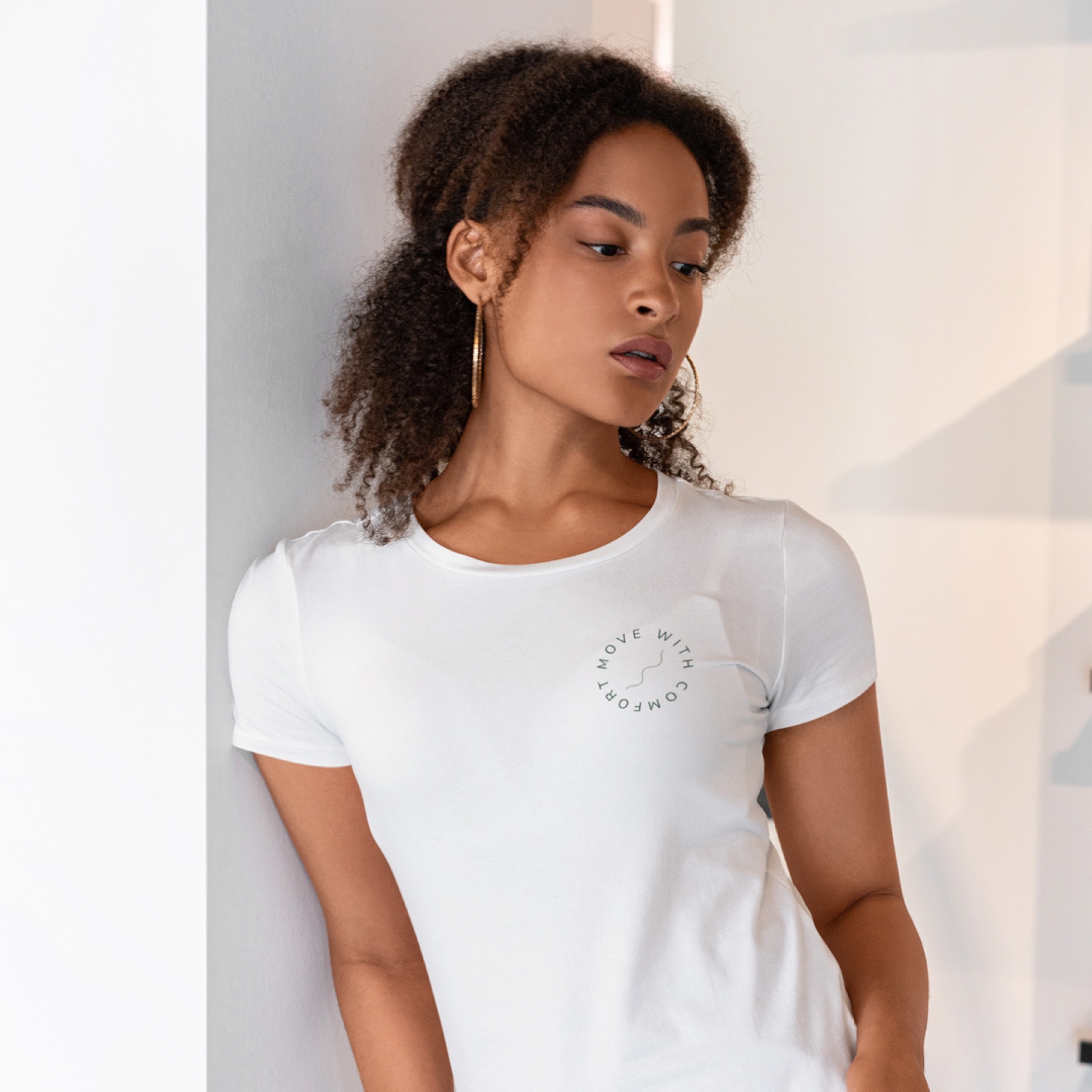
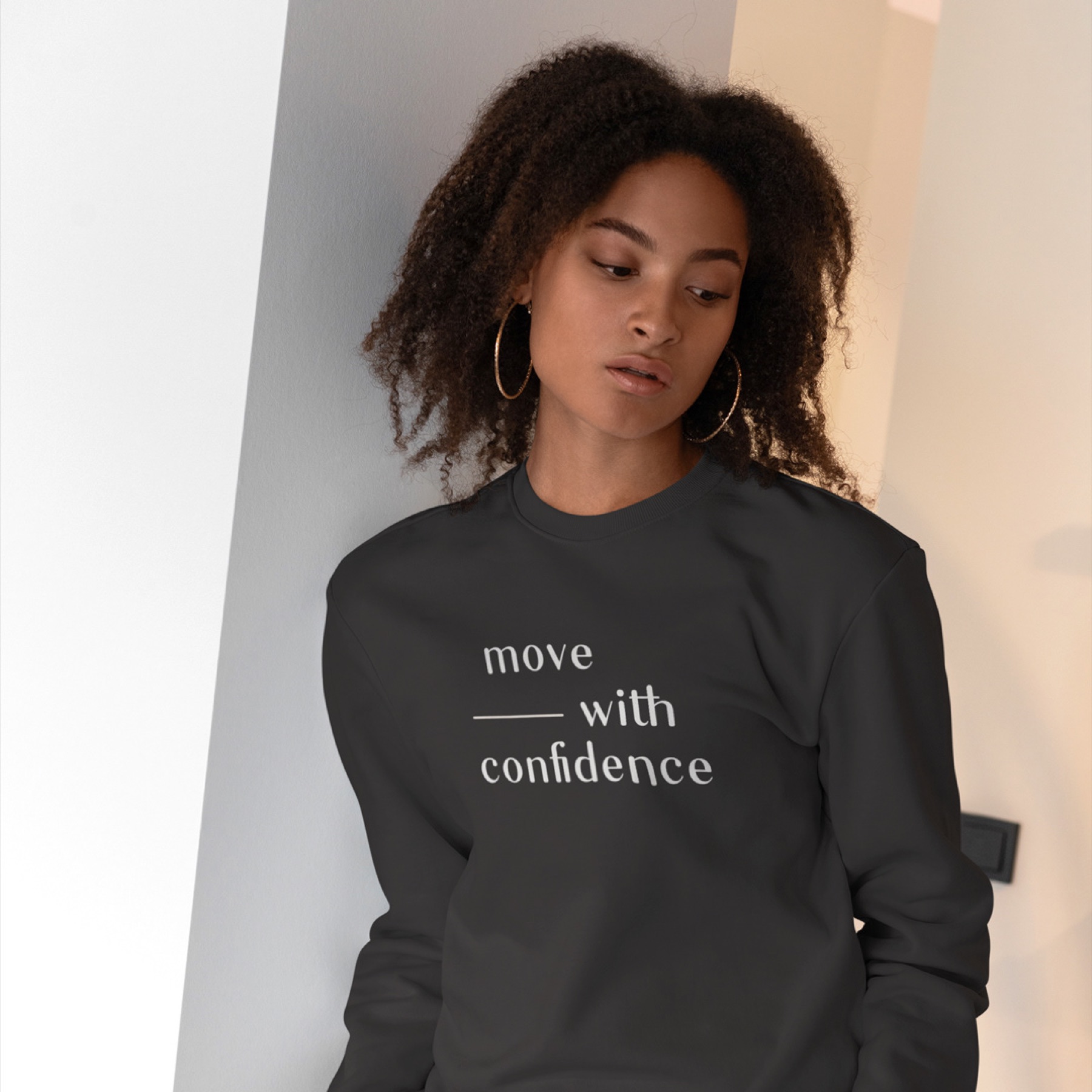
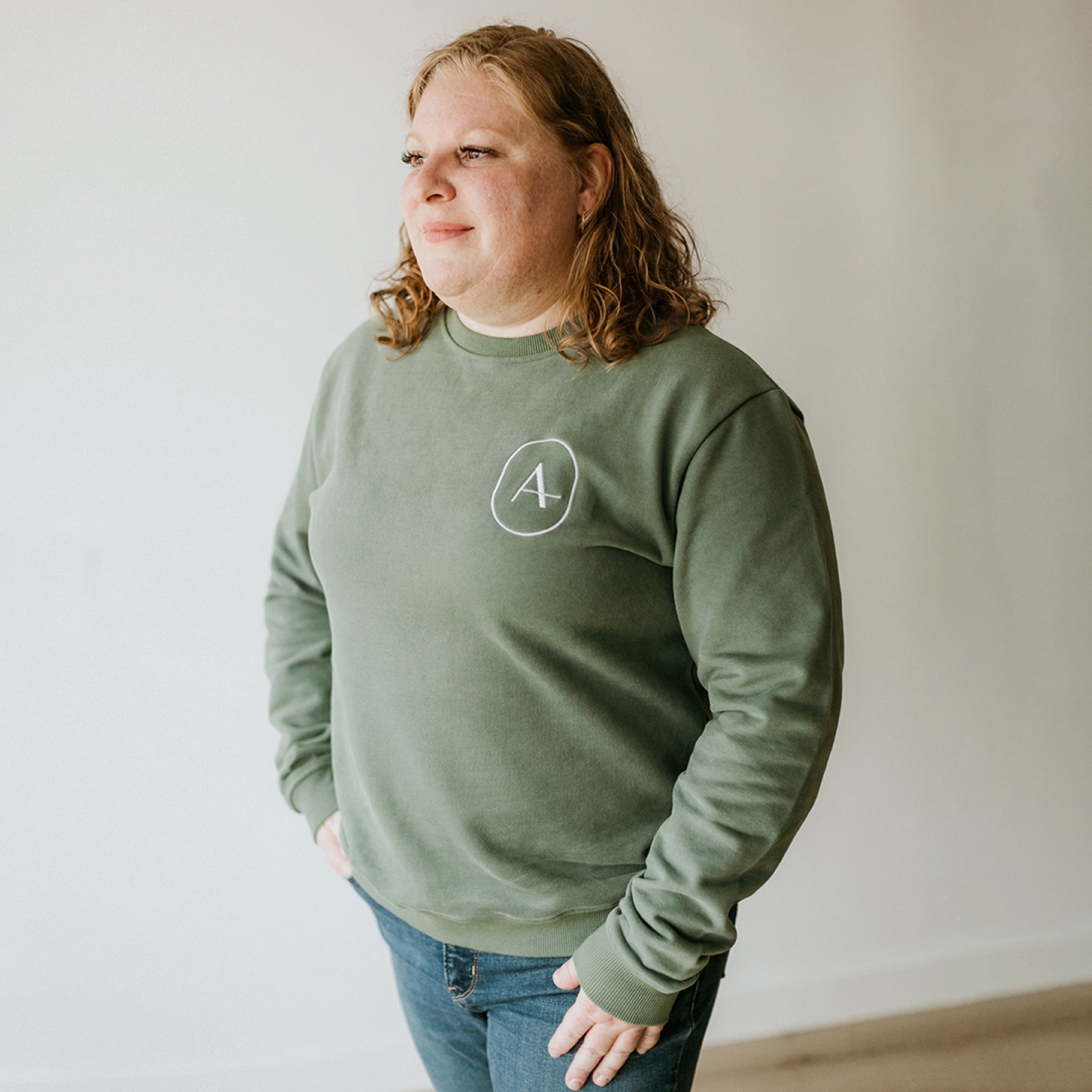
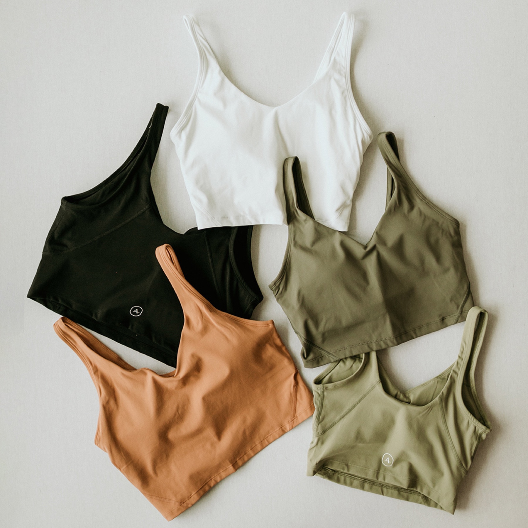
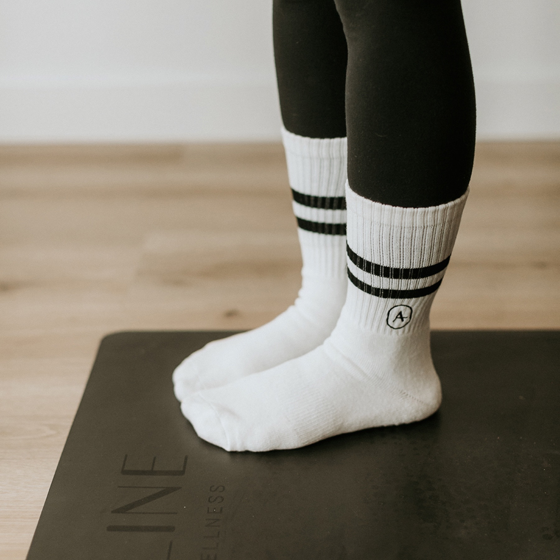
We designed Aline Active as a sub-brand that stays visually consistent with the main identity, so the clinic and the clothing read as one family and every piece worn outside the studio builds recognition.


The website
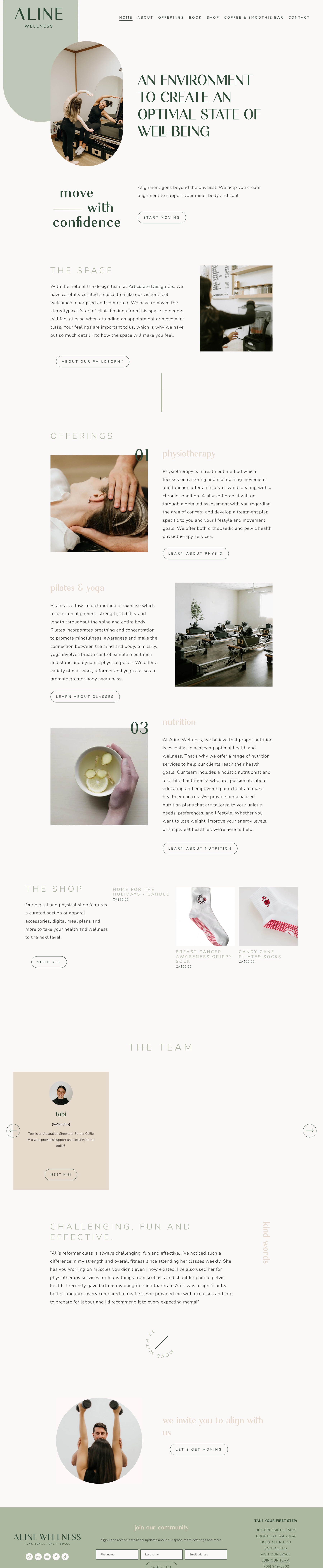
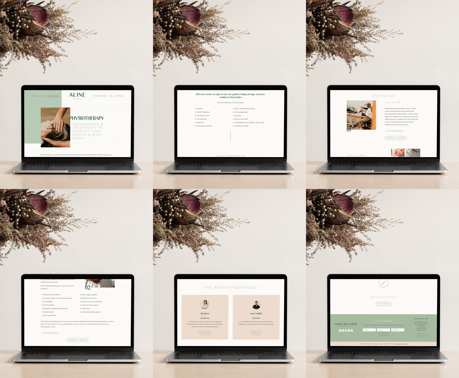
The website is the clinic's front door, so it had to carry the same warmth as the space while doing a lot of practical work: explaining several services, taking bookings on two different systems, selling products and growing a mailing list. I designed it in Squarespace 7.1 as a calm, editorial experience with a clear path for each kind of visitor.

The homepage
One scroll tells the whole story: the promise, the space, numbered offerings, the shop, the team, a client's words and a final invitation to book. Every section ends with one clear next step.
Structure built around what people come to do
Most visitors arrive with one of three goals: understand a treatment, book a session or buy something. The navigation is organised around those goals, so nobody has to know how the clinic works behind the scenes.
Booking without friction
Classes and physiotherapy run on different platforms, Mindbody and Jane, but visitors never have to know that. A single Book menu sends each person to the right system, and the class schedule is embedded on the site so it stays on brand. Service pages repeat the booking button where the decision is made.
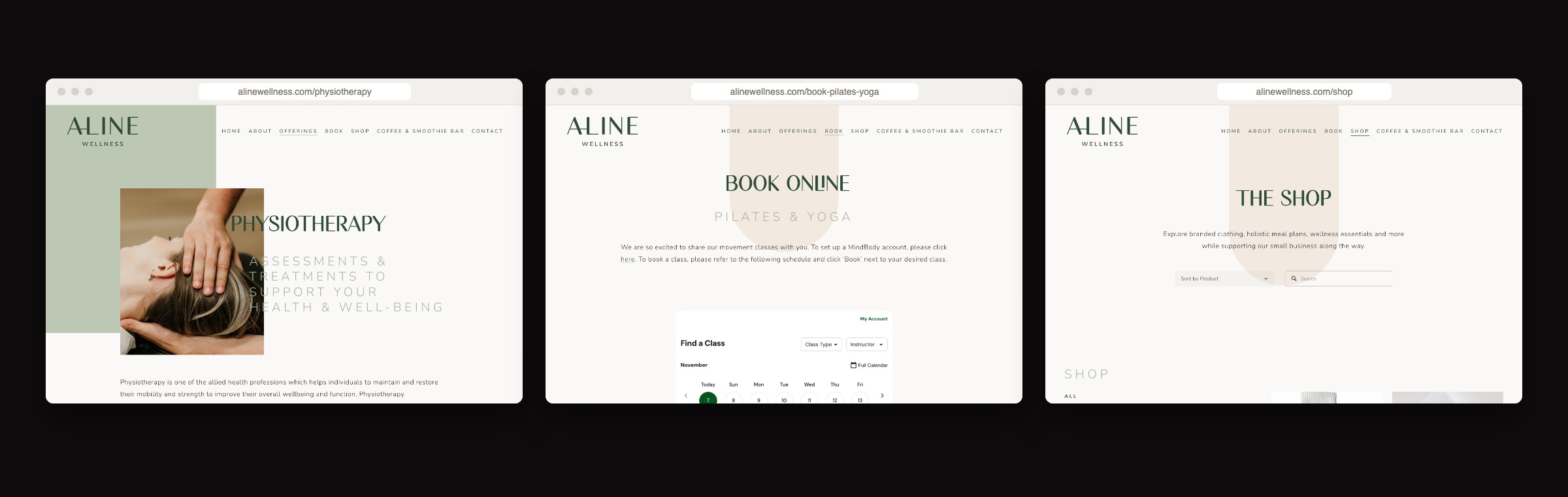
Service, booking and shop pages share one layout system: a soft arch, generous white space and the same quiet type.
A shop that feels like part of the clinic
The online shop sells Aline Active apparel next to accessories and wellness essentials, so the brand travels home with clients. Products appear on the homepage too, inside the story rather than in a separate store.
Small details that build trust
Real photography of the space instead of stock, the team introduced with pronouns and short bios, a client testimonial before the final call to action, and a Flodesk newsletter sign-up that welcomes new subscribers with an automated sequence.
Result
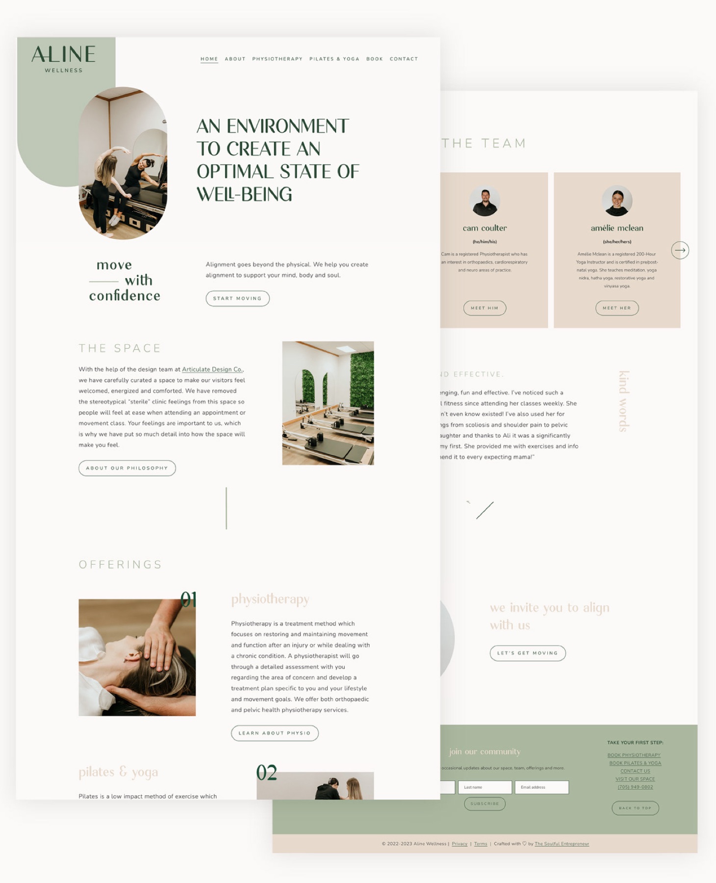
Aline Wellness launched as a modern, welcoming wellness space with one clear voice across the clinic, the website and the clothing. Clients can learn about a treatment, book a class or appointment and shop the collection in a few clicks, and the brand now walks out the door on the people who wear it.